Cool website design examples for your inspiration
A perfect website should be simple, convenient, clear, beautiful, and most importantly – it should sell your product, service or idea.
We’ve got a checklist of good website design criteria for you, as well as some examples of excellent modern website design for your inspiration!
1. Cool website design criteria
1.1. Compliance with the brand style
Take a look at the websites of big brands. Creating your website, you should not change the color solutions that you have chosen once; they are associated with your commercial success. It is true for all sites, even for a business card website.
1.2. The presence of a focal point
In design, the focal point draws attention to the most important arguments of your business – competitive advantages, new products, successful projects, etc. It can be a picture or graphic, headline, or tagline.
You can draw attention to the focal point using size, shape, direction, location, color, texture, or in some other ways. Lucky for you we have some website design inspiration to get you started in the right direction.
1.3. The correct focus of the visitor’s attention flow
When all the design elements are arranged randomly, the viewer does not understand where to look further, and the feeling of flow disappears.
A certain hierarchy of elements is a must for a good website design: design elements must be organized and arranged on the page in such a way that the viewer’s attention flow is directed along a certain “path” (from the most important things (the focal point) – to less important elements).
1.4. Balanced design
Symmetry is one of the most important helpers in creating a balanced design. Asymmetric design is balanced relative to the central axis horizontally, vertically or radially.
We consider symmetry more attractive at a subconscious level, and a balanced design helps to create a hierarchy and prioritize the design elements.
1.5. Matching fonts
The way you select fonts greatly affects the appeal of your website.
You should learn to choose harmonious fonts: in most cases, it’s enough to choose one font with serifs for design – and one without serifs.
1.6. Balance of form and function
The design may look cool, but it may barely fulfill its task: if so, it doesn’t act as an effective communication tool.
If the illustrations and colors aren’t chosen randomly, they deepen the design itself and support the brand image.
1.7. Contrast
Contrast not only makes the design more attractive but also highlights certain design elements against the background, emphasizing their importance.
Contrast colors are not only those which are on opposite sides of the color wheel. In design, shapes, sizes, fonts and other elements can contrast.
1.8. Proper use of space
It is difficult to create an attractive, balanced design in a limited space. But whatever this space is – a business card or a billboard – there are several principles for the layout of elements in the design:
Proximity – the arrangement of interconnected elements at a short distance from each other (and unrelated elements at a bigger distance) – plays a huge role in the design. Grouping related items automatically make the design more logical and organized.
White space. Each element should have enough free space. To achieve that, you can use fields, empty space around and between elements, long line spacing and much more.
1.9. Harmonious color scheme
Of course, it is important to consider the mood that each color brings to the design. However, in addition to that, it is also necessary to think about the color scheme as a whole.
Colors in the design should also be harmoniously combined. Avoid too flashy and too contrasting colors and using too many colors at once.
2. Weblium website templates examples
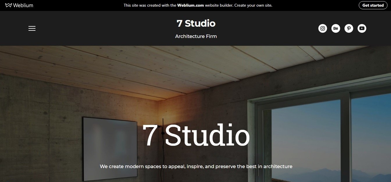
2.1. 7 Studio
7 Studio website was created according to all the “golden standards” of website design creation. A catchy, informative header looks concise and includes a hamburger menu icon, company name, a business tagline, and social network buttons. Here, you immediately see the prominent “View Portfolio” button where you can see high-quality photos illustrating successful projects.
There is plenty of white space, which is interspersed with blocks of dark color – and it looks very stylish. Elements of blue and green are perfectly combined and fit into the overall color scheme.
An informative and concise footer also looks stylish and matches with the style of the entire site.
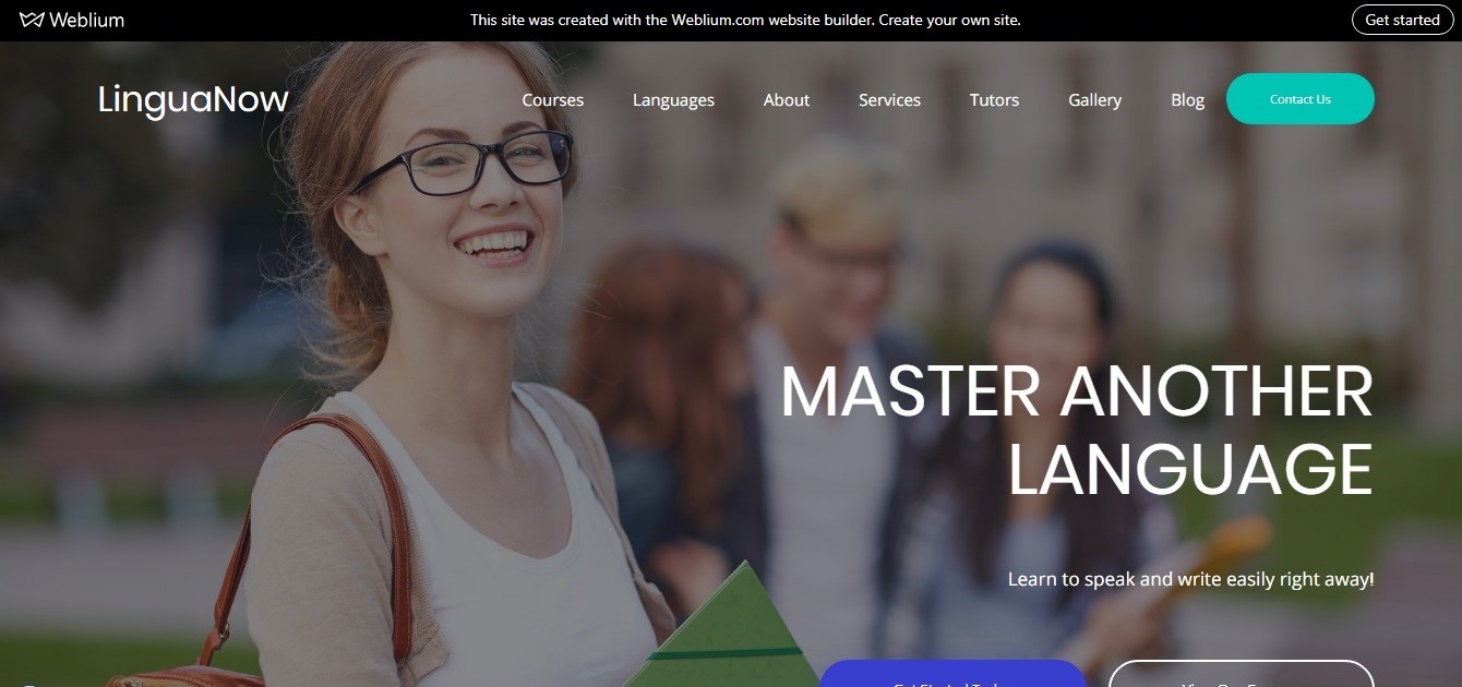
2.2. LinguaNow
Even the header of LinguaNow website clearly explains the essence of its services. The effect is complemented by an exhaustive main menu of the site with a bright contact button and two large CTA “Get started today” and “View our courses” buttons under the slogan.
Take an example from this website: these buttons are in the right place so that the visitor, interested in the service, can immediately learn more and sign up for courses.
Further, according to the logic, come the advantages of the company, and a list of languages to choose from.
It is worth noting the clarity, visibility, and completeness of the information in the «prices» section and an excellent informative footer of the site.
2.3. Lavo Nightclub
Lavo nightclub website captures you right off the bat: the laconic header, in addition to the hamburger menu and social network buttons, displays an interactive banner in which you can view current events and their dates and immediately book a table.
The brief information about the club is complemented by a 3D tour – and this is a very smart move to spectacularly show the advantages of the club.
An extended schedule of events, an offer block with a discount, a downloadable menu with prices and photo gallery sections come next.
The website footer skillfully combines the contacts and the club’s work schedule with a convenient «Book a table» form.