Today, there are many services that allow you to easily and quickly create a unique popup for your business. But even with ready-made popup templates and forms, the popup element must be thoughtful and adapted to the interests of visitors. With the correct and careful use of popups, you can not only increase the conversion of an online store but also benefit customers.
In order to find that very “golden mean,” avoid common mistakes and build trusting relationships with the client without losing loyal customers, you need to know about some rules and principles of creating popups.
Popup rules for an effective UX
If you build a popup correctly, you can increase conversion and keep users on the site. For this, you need to follow the rules:
Write only about the main things
A well-designed popup should not contain more than two sentences. People almost never read the details, so briefly and concisely state the essence of the offer and the call to action. The most important can be underlined in bold.
Don’t hide the “close” icon
Users react negatively to situations when they cannot turn off the popup. Usually, they wait a few seconds, leave the site, and you do not get the contacts you need. Therefore, it is better not to hide the “close” icon, so you will have a better chance of achieving the target action.
Do not launch a pop-up when entering the site
This annoys users, and they immediately leave the site. This leads to the fact that along with a potential client, you also lose positions in the search results. Search engines now take into account behavioral factors, and a user’s quick departure from the site serves as a signal that the page is not interesting to readers. Because of this, search engines remove the site from the top results.
Don’t use a call to action prematurely
Until the user gets acquainted with your product, he is unlikely to agree to leave his contacts. And the pop-up will most likely be closed as soon as it appears on the screen. If you decide to run it again for the same user, he will most likely find the ad intrusive and leave the site.
What else to do to make the popup efficient and friendly:
-
If you are collecting an address or phone number for mailing, make a checkbox “I agree to mail” and a link to the subscription terms in the form. This way, you will avoid problems with advertising law.
-
Make the popup responsive: the user will definitely be sure that the form worked as it should. After filling out and submitting the form, something should happen. For example, thank you for the address and say that the first letter will arrive in a few minutes.
-
Test your popups on different devices and operating systems. You can find and fix layout and functionality errors.
Check your popup for compliance with the rules
The Coalition’s Better Ads Standards has prepared rules for creating popups. If you do not adhere to them, your site may simply be blocked.
What definitely cannot be done:
-
use video with autoplay and sound;
-
start a countdown without the ability to immediately close the popup;
-
fix the pop-up at the bottom of the page so that it takes up more than 30% of the screen;
-
trigger aggressive effects like blinking.
Examples of selling popups
It is important to attract and interest the site visitor in reading the pop-up. This is usually done with the help of contrasting colors, unusual designs, and interesting offers. We offer you to learn in more detail the tricks that will help to attract the attention of the reader and perform the action indicated on the pop-up window.
Popup with rich colors
Marketers and designers often use rich, contrasting hues to grab attention. It is not necessary to use bright acid colors. It is better to choose deep beautiful shades that are combined with your informational message. This draws attention to the offer and therefore increases the effectiveness of the call to action.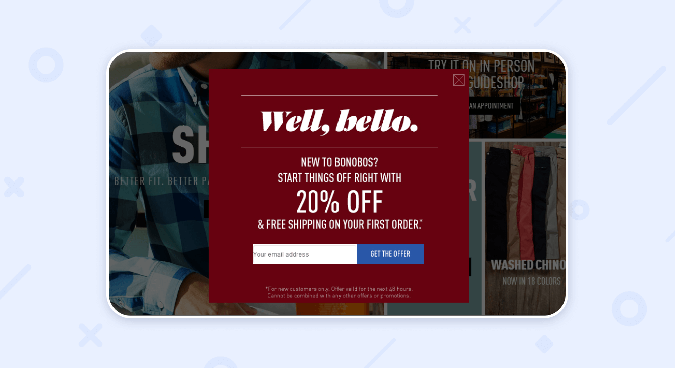
Popup window with a link to newsbreak
If you have some kind of promotion dedicated to the holiday, feel free to mention it in the pop-up. Perhaps the person did not have time to go to the section with special offers. By creating such a popup, you will notify visitors and redirect them to the desired page. On it, a potential client will get acquainted with the offer and products, become interested, and purchase your product.

Popup with an interesting offer (promotional offer)
It’s the most important! If a site visitor is even a little interested in your product, a pop-up with an attractive offer that appears in time will most likely convert him into a buyer. It is better to show such a window when the visitor is sufficiently familiar with the information on the site, for example, after 65% scrolling the page or after two minutes of being on it.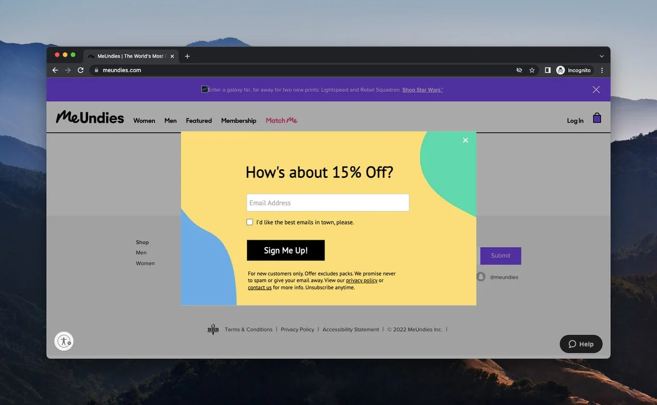

Eye-catching design on the pop-up window
Originality is the key to success. Use non-standard shapes of the window itself, and your pop-up will definitely help increase sales! And an attractive offer will help to get the desired customer contact.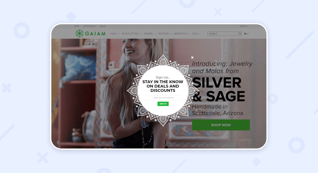

Popup animation
Human consciousness always notices objects in motion. Add a timer, a small animation in the form of an animal, person, or another object to grab the visitor’s attention. But don’t overdo it! No need to create a popup that will be the size of the entire screen and with too fast animation. Such a window will only scare away visitors.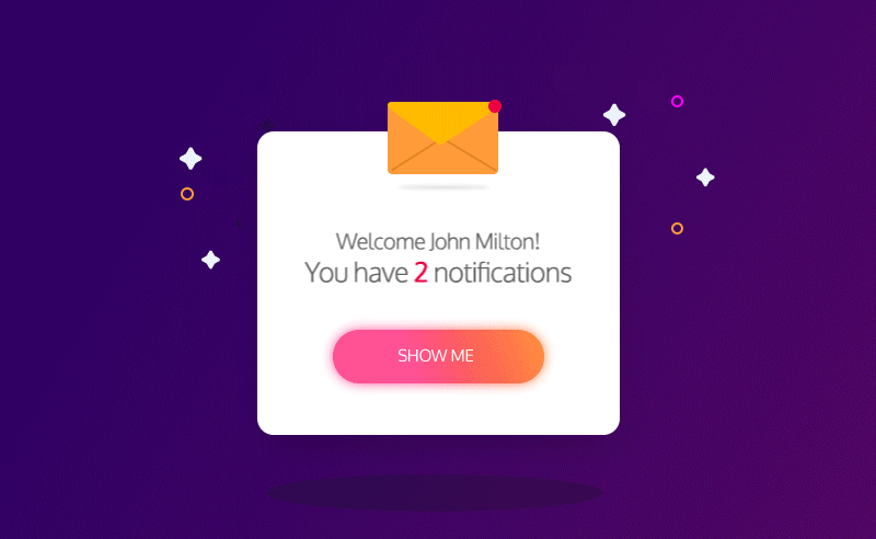

Conclusion
To create a good and high-quality pop-up that will benefit the site owner and customers, it is not necessary to be a great marketer. It is enough to know your target audience well in order to give people what they want and what will be useful for them in return for a subscription.
Also, do not forget about the strategy. Although this word scares many, in fact, there is nothing complicated about it. A strategy is just a sequence of actions that you need to follow in order to get the maximum result.

